Hello fellow programmers!
This post is about how we can use component composition and inheritance principals to extend our components as opposed to relying solely on props.
This approach has proven to be especially useful when working with medium-large size components.
We all know how to write our components, but when it comes to scaling them, I see many developers making an inaccuracy of extending components with adding props without giving it a second thought.
And it is an understandable natural instinct, because it's the first thing that comes to mind, but it doesn't necessarily mean that it is your best option.
The Problem
When we extend a component with props, with each prop we add more conditional logic to it. Which in turn leads to maintainability issues down the road as the project grows, especially if there are multiple developers working on it.
- As more variations and conditionals are added, the component can become harder to manage. Too many props can lead to “prop hell”, making the component’s logic difficult to follow.
- Handling all variations in a single component can bloat it, making it less readable and harder to maintain.
- If the component has too many conditionals, it might impact rendering performance, especially if it's frequently re-rendered.
The Solution
Utilize inheritance principals by creating a Base component (which contains all the functionality common for all the component variations) and extending it with other derived components - a component per variation.
These "child" components should extend the Base component with functionality specific to their case, contributing to the Separation of Concerns and maintainability.
You might have noticed similarities with OOP — that's because this approach relies on the same principles, like inheritance and encapsulation, to make the code more modular and maintainable.
I should mention that this is absolutely not a one-size-fits-all solution. And I'm not saying that we need to start utilizing it for every small component we write.
It probably won't be worth it creating separate
PrimaryButtonandSecondaryButtoncomponents, because these two variations won't have the functionalities distinct enough to justify the separation. After all, it's the same button with slightly different styles, and this kind of component won't get too complicated anyway if we handle the variations with props.
Don't take the principles described here as absolute, if you choose to use this component composition strategy, it's going to be a hybrid mode anyway. There will be some components that play better with props, others that benefit from inheritance.
But if you're starting to run into maintainability problems because of some of your components growing out of control, maybe it's time to explore this technique.
If you're interested to learn more about this approach with examples and code snippets - keep reading!
Example app
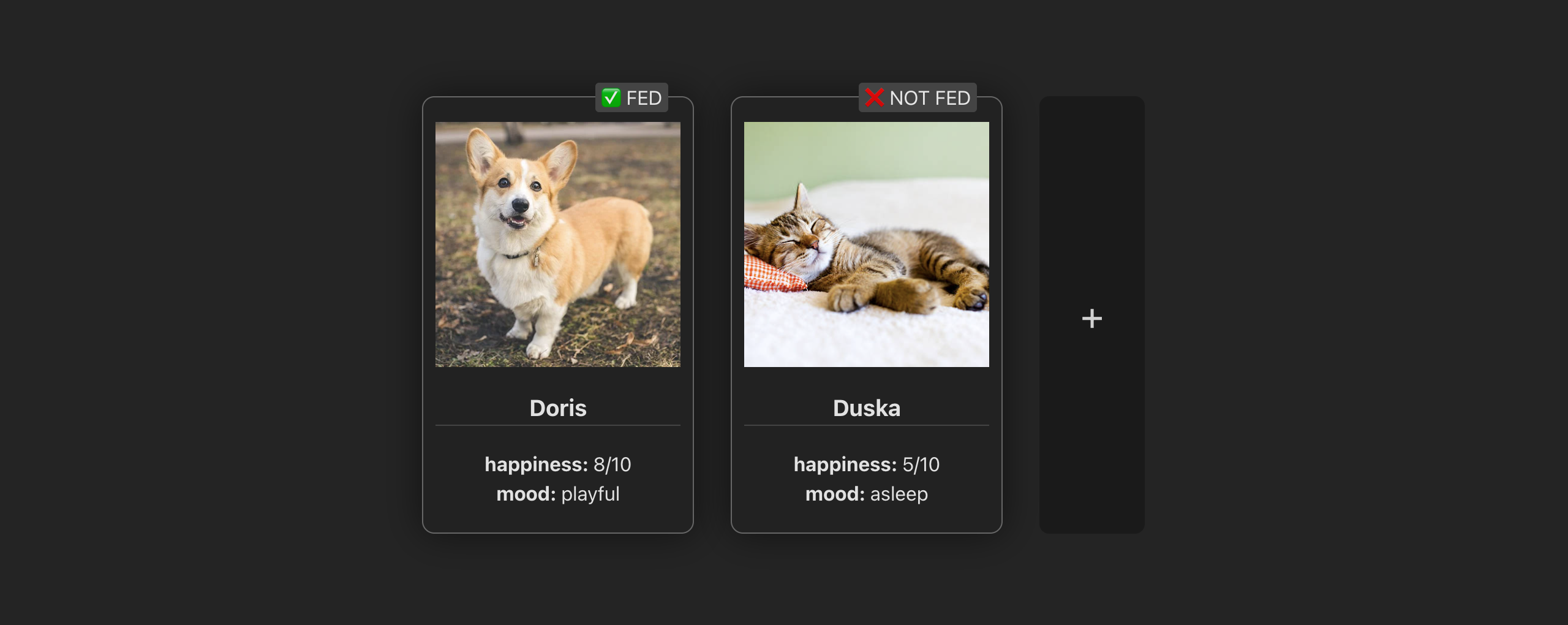
In this example app we're displaying the cards which represent the contents of some hypothetical user inventory.
Right now the only item type that the user can have is a pet.
You can see that the item component we're using renders a card-shaped container with the pet's picture, name, and some stats.
It also shows an "is fed" label up top.
Iteration 1
Let's see what the code for this component looks like.
I'm using Vue for this example code, but the concept applies to any frontend framework or library.
If you're not familiar with the Vue syntax, don't worry as I will explain everything in detail line by line.
First we declare component props, which in Vue looks like this:
const props = defineProps<{
  pet: Pet
}>()
Our component exposes a single prop called pet and it has a type of Pet.
And here's the expanded Pet type that we're using:
type Pet = {
  type: 'pet'
  pictureUrl: string
  name: string
  happiness: number
  maxHappiness: number
  mood: string
  lastFed: number
}
It decares the type field with a literal string type of 'pet'. We can use this field to check what kind of item we're dealing with.
As well it contains a picture URL for our pet, its name as well as some of its stats.
Now that we're familiar with the data structure that we're dealing with, let's get back to our component.
The Script:
First, let's have a look at what's happening in the script:
const imageStyle = computed(() => ({
  backgroundImage: `url(${props.pet.pictureUrl})`
}))

const stats = computed(() => ({
  'happiness': `${props.pet.happiness}/${props.pet.maxHappiness}`,
  'mood': props.pet.mood
}))

const isFed = computed(() => (
  props.pet.lastFed > Date.now() - 30000
))
We can see that we have some computed properties.
Computed property in Vue is a piece of state that depends on other reactive variables and gets updated every time one of its dependencies changes.
3 things are happening here:
- First we get an image style object - it simply takes our pet's picture URL and wraps it into a CSS string. We'll use it later in the template.
- Then we parse a stats object. We pick the fields that we want to display in the "stats" block from our initial pet object, and return a new object where the key is a display name of a stat and the value is its value. We're going to iterate over this object in the template.
- And lastly, we compute a boolean state of whether our pet is fed or not. For the sake of this example, a pet is considered fed when it was last fed less than 30 seconds ago.
The Template
Next let's look at the template:
<div class="my-card">

  <!-- image -->
  <div
    class="img"
    :style="imageStyle"
  />

  <!-- name -->
  <h3>{{ pet.name }}</h3>

  <!-- stats -->
  <div
    v-for="statValue, statName in stats"
    :key="statName"
  >
    <span class="stat-name">{{ statName }}: </span>
    <span class="stat-value">{{ statValue }}</span>
  </div>

  <!-- fed label -->
  <div class="fed-label">
    {{ isFed ? '✅' : '❌ NOT' }} FED
  </div>

</div>
Here we're doing the following things:
- Display the pet's image,
- Display the pet's name,
- Iterate over our computed stats and output them in key: value manner,
- Display the "fed" label in coherence with the computed state.
That's it for the template.
Our component also declares some styles, but I won't list them all here for simplicity sake, let's just assume they're there.
Iteration 1 Results
As of this moment, everything in our component is perfectly in its place. It does not require any refactoring whatsoever: it's simple, straightforward, easy to read and work with.
Iteration 2
But what happens if we add a different item type to the mix?
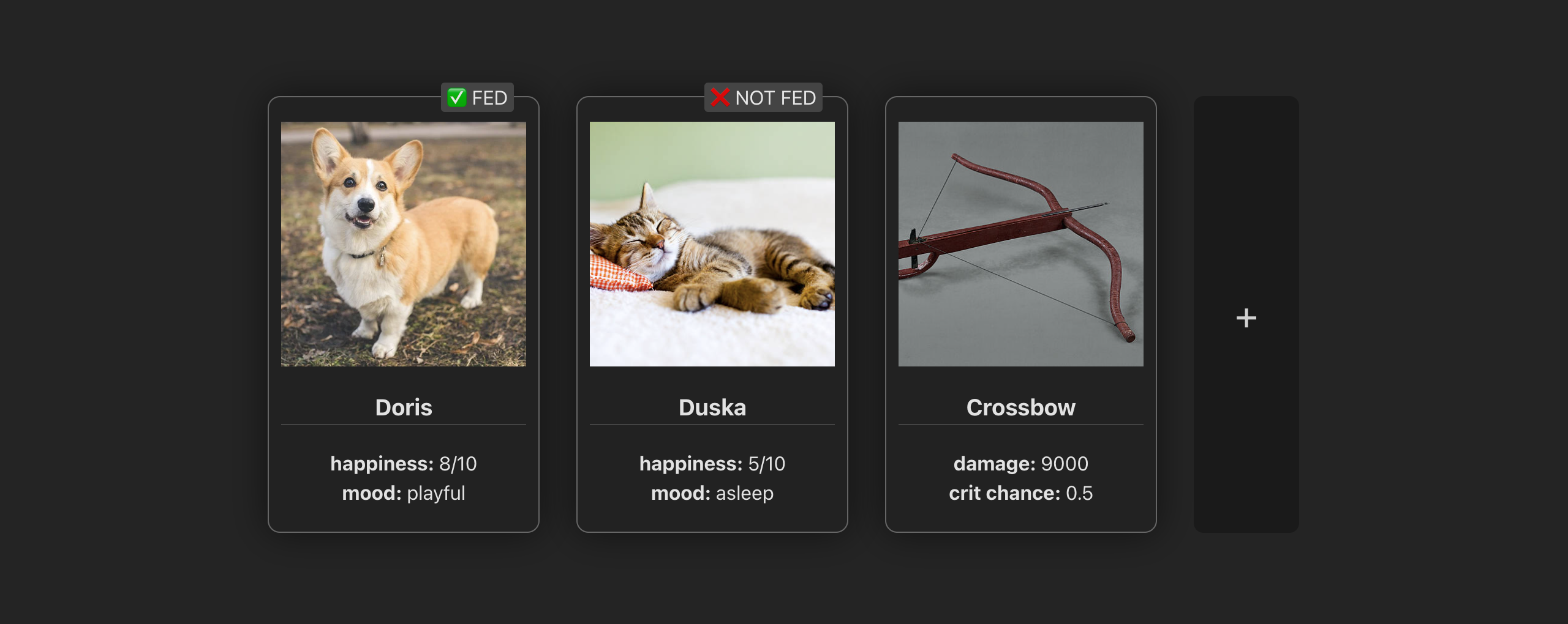
You can see that in this next iteration of our project, a different item type was added - a weapon.
Its appearance shares a lot of similarities with the first one we had, but there are some subtle differences as well. Here's what's different:
- There is no "fed" label of course - you don't need to feed your weapons.
- And the stats, while still in place, list completely different properties.
Everything else seems the same, so let's go back to our code and see how we can modify it to keep up with this new item type.
Extend the Component's Props
The first and the most natural thing to do in this situation is to extend the type of our prop.
As you will see as you keep reading, it'll turn out to be a mistake. But I want to show you how easy it is to fall for this trap because of how natural it feels.
So let's extend our prop:
const props = defineProps<{
  item: Pet|Weapon
}>()
You can see I have renamed our prop to item, because it can now be of both type Pet and Weapon.
By the way, here's an expanded Weapon type:
type Weapon = {
  type: 'weapon'
  pictureUrl: string
  name: string
  damage: number
  critChance: number
}
Right away you can see that, in the same manner as the pet, it has a type field, but this time it says 'weapon'. Just like the pet it has a picture and a name, but all the other fields are different.
The Script
Now, let's look at what needs to change in the script:
The image part doesn't need to change since it's the same for both the pet and the weapon.
But as we go to the stats, we can see that this one requires some updates. The stats object for the weapon needs to be completely different from the pet, it has different keys, and it uses different properties of the weapon object as values.
So here's the updated version:
const stats = computed(() => {
  switch (props.item.type) {
  case 'pet':
    return {
      'happiness': `${props.item.happiness}/${props.item.maxHappiness}`,
      'mood': props.item.mood
    }
  case 'weapon':
    return {
      'damage': props.item.damage,
      'crit chance': props.item.critChance
    }
  }
})
We had to add a switch case statement to our computed, checking the item type, and returning a different object for each of them. In case of a pet it returns its happiness and mood, like it did in the first iteration, and in case of a weapon, it returns its damage and crit chance.
As we keep going, we notice that our isFed computed needs to be updated as well:
const isFed = computed(() => {
  if (props.item.type != 'pet') {
    return false
  }
  return props.item.lastFed > Date.now() - 30000
})
Because only the pet can be fed or not, we add an if statement, returning false for any item but the pet. And if we're dealing with the pet, we run our computation from earlier and return the result.
The Template
Next, let's update the template:
The only thing that needs to update in the template is our "fed" label. Since it's only relevant for the pets, we need to add a condition here as well, otherwise we would end up with "not fed" weapons.
<div
  v-if="item.type == 'pet'"
  class="fed-label"
>
  {{ isFed ? '✅' : '❌ NOT' }} FED
</div>
Iteration 2 Results
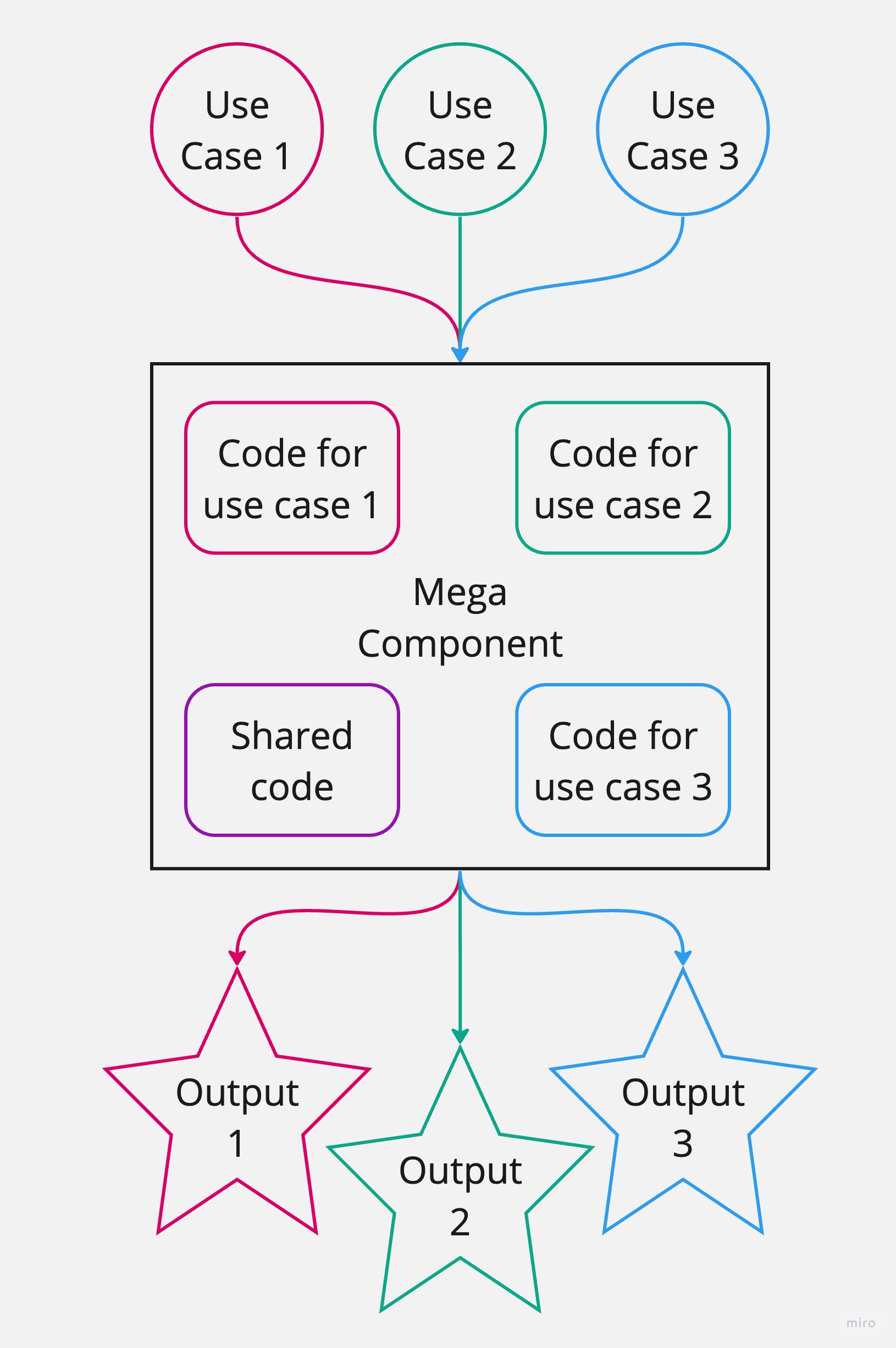
You may begin noticing the pattern here: during the second iteration, we didn't add any business logic, any new elements or styles, and still our component grew in terms of amount of code and its complexity.
The computed properties used to be single-line, simply returning some value. And now they all contain some conditional statements, that have nothing to do with business logic. Instead, they are solving problems of our poor component composition decisions.
Same applies to the change that we introduced to the template.
This all sums up to: we have added a layer of complexity that wasn't there by design.
Iteration 3
Let's take it one step further and add another item type

We have added a new item to our application - this time it's an amulet.
And while it still shares some similarities with the other two, you can notice right away that there is one significant difference: this item has no stats whatsoever. Instead, it has an ability, and this ability is displayed in place of stats with a completely new design.
Since we've already started extending our component's prop's type, let's keep going extend it a bit further.
Side note: in reality, it's never to late to question your component composition decisions. If during some iteration you notice something is off and can be improved, don't think "I'm already doing it this way, it's too late to fix this now, I should keep doing the same". Instead, think "This doesn't look right, now is the best time to fix it, because next time it will be twice as hard".
Extend the Component's Props
const props = defineProps<{
  item: Pet|Weapon|Amulet
}>()
Now our item can be any of these three types.
And here is an expanded Amulet type for you to get familiar with:
type Amulet = {
  type: 'amulet'
  pictureUrl: string
  name: string
  ability: Ability
}
type Ability = {
  type: 'passive'|'active'
  name: string
  pictureUrl: string
}
The Script
Now let's see what needs to change in the script:
Like before, the image portion remains untouched. And the "fed" label doesn't require any changes from the last time.
But we need to add another case to our switch in the stats computed:
const stats = computed(() => {
  switch (props.item.type) {
  case 'pet':
    return {
      'happiness': `${props.item.happiness}/${props.item.maxHappiness}`,
      'mood': props.item.mood
    }
  case 'weapon':
    return {
      'damage': props.item.damage,
      'crit chance': props.item.critChance
    }
  case 'amulet':
    return {}
  }
})
If the item is an amulet, we will return an empty object, so that our for loop in template doesn't render anything.
Also we'll add a computed for the ability icon style:
const abilityIconStyle = computed(() => {
  if (props.item.type != 'amulet') return {}
  return {
    backgroundImage: `url(${props.item.ability.pictureUrl})`
  }
})
Just like the "fed" label in the previous iteration, it's only relevant for a certain type of item. So we need to add an if statement checking the item to be an amulet.
The Template
Next up, changes to the template:
<div
  v-if="item.type == 'amulet'"
  class="ability"
>
  <div
    class="ability-icon"
    :style="abilityIconStyle"
  />
  <div class="ability-info">
    <span class="ability-description">
      {{ item.ability.type }} ability
    </span>
    <span class="ability-name">
      {{ item.ability.name }}
    </span>
  </div>
</div>
We add this block to display our ability, of course conditionally - only if it's an amulet, with the item type check at the root element.
Then, we apply our computed ability icon style and display some information about the ability.
Like before, we will add styles for all of these elements to our component as well, but I won't include them here.
Iteration 3 Results
After the third iteration we're seeing the same problems that we did after the second one. Only now they're even more apparent. There are conditional checks all over the place, and our component got even harder to navigate and maintain.
Moreover, we can see that some code (both in the script, the template and the styles) is relevant only in 33.3% of the use cases - only if a certain type of item is passed as a prop.
That is, everything that is has to do with the pet's "fed" label and everything connected to the amulet's ability. All of that code feels out of place.
OOP Parallel
Let's take a short break from overloading our component with complexity and take a look at what we're doing from an OOP point of view.
Imagine for a minute that we we're not dealing with a component, but instead with a plain class.
Here's what our component would look like as a class (after all the applied extensions):
class ItemCard {

  item: Pet|Weapon|Amulet
  constructor(item: Pet|Weapon|Amulet) {
    this.item = item
  }

  get name() {
    return this.item.name
  }

  get image() {
    return this.item.pictureUrl
  }

  get stats() {
    switch (this.item.type) {
    case 'pet':
      return {
        'happiness': `${this.item.happiness}/${this.item.maxHappiness}`,
        'mood': this.item.mood
      }
    case 'weapon':
      return {
        'damage': this.item.damage,
        'crit chance': this.item.critChance
      }
    case 'amulet':
      return {}
    }
  }

  get isFed() {
    if (this.item.type != 'pet') {
      return false
    }
    return this.item.lastFed > Date.now() - 30000
  }

  get abilityImage() {
    if (this.item.type != 'amulet') return null
    return this.item.ability.pictureUrl
  }
}
You can see that the constructor here is expecting an item of type Pet|Weapon|Amulet and assigns it to the corresponding property with the same type.
So all of the getters (which are the reincarnation of the computed properties) need to run the same conditional checks as our component did.
And I think that at this point we can all agree that it's a bloody mess.
A class should not implement methods that are irrelevant to it. For example, abilityImage should only exist in the Amulet class. And the same goes for the isFed and Pet.
Luckily, in the OOP paradigm nobody writes classes like this. In the OOP world the concept of Abstract (or Base) and Derived classes is strongly understood and very commonly used.
Abstraction
Let's see how we can implement the abstract class in our case:
We can take everything that is common for our item types and move it to a separate abstract class:
abstract class BaseCard {
  abstract item: Pet|Weapon|Amulet

  get name() {
    return this.item.name
  }

  get image() {
    return this.item.pictureUrl
  }
}
We declare item as an abstract property limiting it to the three item types that we have, but leaving the actual resulting type to be implemented by the derived class.
And we move name and image here too, because those two are common for all of our items.
And that's it for our abstraction! Everything else is left to be implemented by the actual classes. Let's code them up as well...
Pet Class
We'll start with the Pet class
class PetCard extends BaseCard {
  item: Pet
  constructor(item: Pet) {
    super()
    this.item = item
  }

  get isFed() {
    return this.item.lastFed > Date.now() - 30000
  }

  get stats() {
    return {
      'happiness': `${this.item.happiness}/${this.item.maxHappiness}`,
      'mood': this.item.mood
    }
  }
}
We declare item as Pet here. And the constructor expects only a Pet.
This class has an isFed getter, and it implements the version of stats that is relevant for a pet item.
You can notice that the code simplicity in those getters is somewhat reminiscent of the first iteration, when we only had one item type in our app. That is because there aren't any conditions - we don't need to check the item type because we only expect one.
Weapon Class
Next let's implement a Weapon class:
class WeaponCard extends BaseCard {
  item: Weapon
  constructor(item: Weapon) {
    super()
    this.item = item
  }

  get stats() {
    return {
      'damage': this.item.damage,
      'crit chance': this.item.critChance
    }
  }
}
Here - similarly - we expect only a Weapon and implement the relevant version of the stats. Again - no conditions, everything lean and simple.
Amulet Class
And lastly let's implement the Amulet class:
export class AmuletCard extends BaseCard {
  item: Amulet
  constructor(item: Amulet) {
    super()
    this.item = item
  }

  get abilityImage() {
    return this.item.ability.pictureUrl
  }
}
Same principle here.
The Takeaway from our OOP Experiment
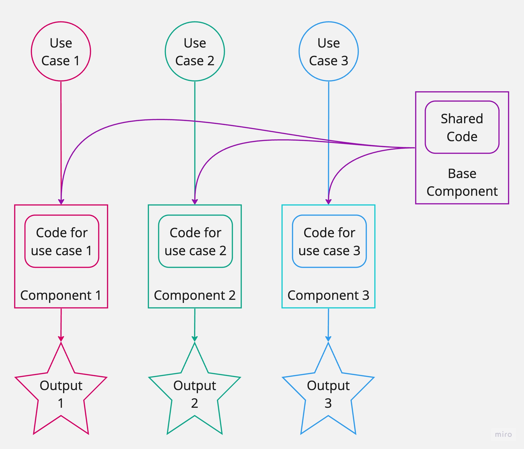
You can see that by declaring the abstraction - and creating three separate derived classes from it, we have simplified our code a great deal.
Instead of having all code in one place resulting in a class that was hard to read and navigate, instead of having blocks of code that felt like they don't belong, we have created a system that feels right, reads and scales easily.
- Everything about pets is in the
Petclass, - Everything about weapons - in
Weapon, - And amulets - in
Amulet
And the best part is, we could have 20 more of different item types with different features and they would not add any complexity to our codebase.
Apply the Same OOP Principles to our Component
How do we do that? Very simple. We will do the same as we did with the classes earlier.
We'll create a separate component for each item type and a single Base component that they all will extend.
We'll call it ItemBase.
Base Script
Let's start with the base component's script.
Here's what its script will look like:
const props = defineProps<{
  name: string
  pictureUrl: string
  stats?: Record<string, string|number>
}>()

const imageStyle = computed(() => ({
  backgroundImage: `url(${props.pictureUrl})`
}))
We can move the computed image style in here, since it's the same for all items.
And in the props you can notice that we don't limit the component to any existing item types. Instead we're making it fully abstract by letting the consumer component pass name and picture url as string values.
As for stats, we expect an object with string keys and string or number values, and we will render all fields of this object in the template (like we did before). But the key difference is we leave the computation of this stats object up to the consumer.
It is now up to every individual item component to decide what stats it needs to display, parse them as object, and pass it down to this base component. Which will take care of the shared part - rendering them as a list.
I should note that the stats prop is optional (you can see it's declared with a question mark), meaning that consumer component is free to leave it undefined. This will be important for our Amulet component - since it doesn't have any stats.
Base Template
Here's our base component's template:
The main thing to notice here is that we're adding a slot.
The slot is our gateway to extending this component with more elements. That is where all the unique content of "derived" components will go.
<div class="my-card">

  <div
    class="img"
    :style="imageStyle"
  />
  <h3>{{ name }}</h3>

  <template v-if="stats">
    <div
      v-for="statValue, statName in stats"
      :key="statName"
    >
      <span class="stat-name">{{ statName }}: </span>
      <span class="stat-value">{{ statValue }}</span>
    </div>
  </template>

  <slot />

</div>
Same as before, this component also implements the styles for all of the elements in its template, but I'll leave them out of this post.
Now let's implement our "derived" components.
Pet Component
The script:
const props = defineProps<{
  pet: Pet
}>()

const stats = computed(() => ({
  'happiness': `${props.pet.happiness}/${props.pet.maxHappiness}`,
  'mood': props.pet.mood
}))

const isFed = computed(() => (
  props.pet.lastFed > Date.now() - 30000
))
You can see that we're back to where we started:
- props expect only
Pettype - there is no conditional logic in our computed properties
And here's the template:
<ItemBase
  :name="pet.name"
  :picture-url="pet.pictureUrl"
  :stats="stats"
>
  <div class="fed-label">
    {{ isFed ? '✅' : '❌ NOT' }} FED
  </div>
</ItemBase>
The template has change significantly.
Since all of the common markup for our components now lives inside of the base ItemBase component, all we need to do here is:
- use the Base component,
- provide the props it expects,
- and extend it through slot with the additional markup ("fed" label) that is unique for the pet
Perfect, let's move on.
Weapon Component
Here's the script:
const props = defineProps<{
  weapon: Weapon
}>()

const stats = computed(() => ({
  'damage': props.weapon.damage,
  'crit chance': props.weapon.critChance
}))
Similarly to the pet, we expect a single typed prop: a Weapon, and parse the stats object relevant for this item type.
The template here is even simpler:
<ItemBase
  :name="weapon.name"
  :picture-url="weapon.pictureUrl"
  :stats="stats"
/>
Since the weapon doesn't have any additional markup, it's enough to simply hook up the Base and provide the information it requires.
Amulet Component
The script:
const props = defineProps<{
  amulet: Amulet
}>()

const abilityIconStyle = computed(() => ({
  backgroundImage: `url(${props.amulet.ability.pictureUrl})`
}))
Like with other two components, we expect a prop of a single item type: Amulet.
Here we also have a computed property for the ability icon which is unique for this component.
The template for amulet component implements the Base component like this:
<ItemBase
  :name="amulet.name"
  :picture-url="amulet.pictureUrl"
>
  <div class="ability">
    <div
      class="ability-icon"
      :style="abilityIconStyle"
    />
    <div class="ability-info">
      <span class="ability-description">
        {{ amulet.ability.type }} ability
      </span>
      <span class="ability-name">
        {{ amulet.ability.name }}
      </span>
    </div>
  </div>
</ItemBase>
We pass the name and the picture URL, but this time we don't pass any stats, because the component doesn't have any.
Instead, we provide the ability markup to the slot, using the computed style that we prepared in the script.
As always, we also add styles to this component related to the ability markup.
And that's it for our components!
Conclusion
Yay you made it! This was quite a rollercoaster, huh?
At first we've made a not the best choice to extend our component with props instead of using component composition. Which, after a couple of iterations, turned our component into a mega-component that depended heavily on conditional checks, and contained all the code for every possible use case.
In the end we managed to split our mega-component into three separate components relying on a single Base component. Which in turn made our system more maintainable, easy to read and work with.
Before
After
It's easy to see why it felt so natural in the beginning to make the mistake of using a single component and extending its props.
If you look closely at our Pet, Weapon and Amulet item types, you will see they are very similar (except for the things that are different). And if you look at the visual aspect, there are a lot of similarities there as well.
All of that tricks our brain into thinking that all of the item types should be handled by a single component. When in reality it was very much possible to find a better abstraction and separate the repeated pattern into its own component, at the same time keeping the things that are different straightforward and maintainable.
And if we focus on keeping our components lean and clean, we'll be on our way to building better codebases.
Happy coding!